City of Boston’s new Boston.gov
Creating a welcoming, citizen-centered site for all Bostonians.
THE GOAL:
Redesign the website for the City of Boston to be more modern and citizen-centric.
THE RESULT:
A city website that takes into account what users need and offers simple, intuitive navigation.
MY ROLE:
Project Lead, Lead Design Researcher and Strategist, Digital Product Manager
Timeline:
January - July 2015
With more than seven million visitors a year and over 50 different departments, each with their own microsite, the City of Boston website was in need of an overhaul. They wanted a beautiful platform that made it easy and intuitive to find information and prioritized the needs of its people.
My team of two worked with stakeholders inside City Hall and out in the community, prioritizing the needs of underserved communities and those with low technical skills to gather insights.
Four strategic design principles I created as a result of design research. These were used to guide the digital design work for this project, and still guide the City’s digital team today.
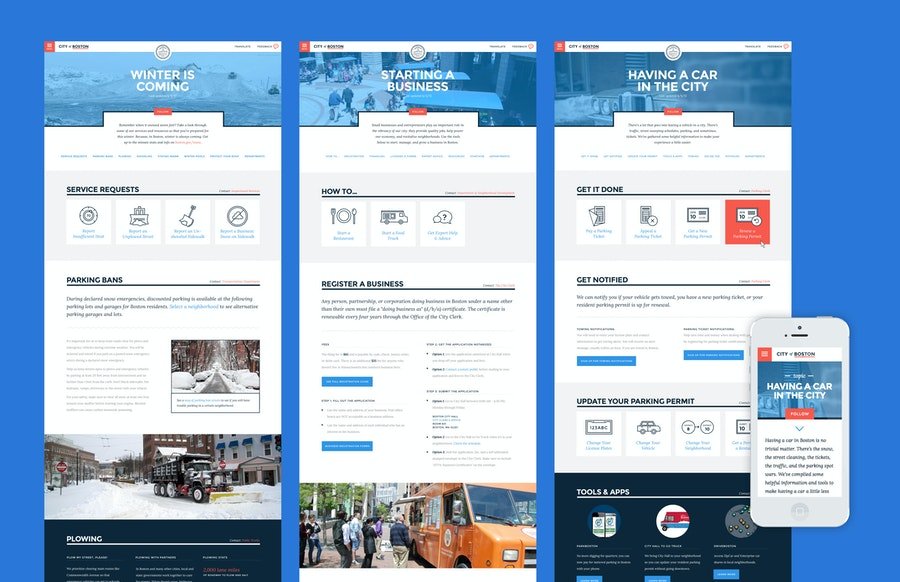
What resulted from an 8-week project is a beautifully designed site organized by topic, or citizen’s life moments, such as owning a car, preparing for winter, or voting. The content was designed in modular pieces called components, which made the design flexible and allowed for distributed content creation across the 50+ departments.
Seven candidates for pilot launch created for a mid-point workshop. Interaction designs by Kim Miller.
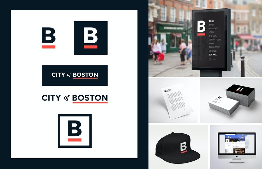
The team also created a new visual identity system, including new typography, iconography, and photo guidelines, and put everything together into a comprehensive style guide (released by the city as “Brand Guidelines”). The project received a Comm Arts Interactive Award in 2017.
A new brand for the City of Boston, integrated into the new website launch and across all city assets. Brand design by Nick Dupey.


